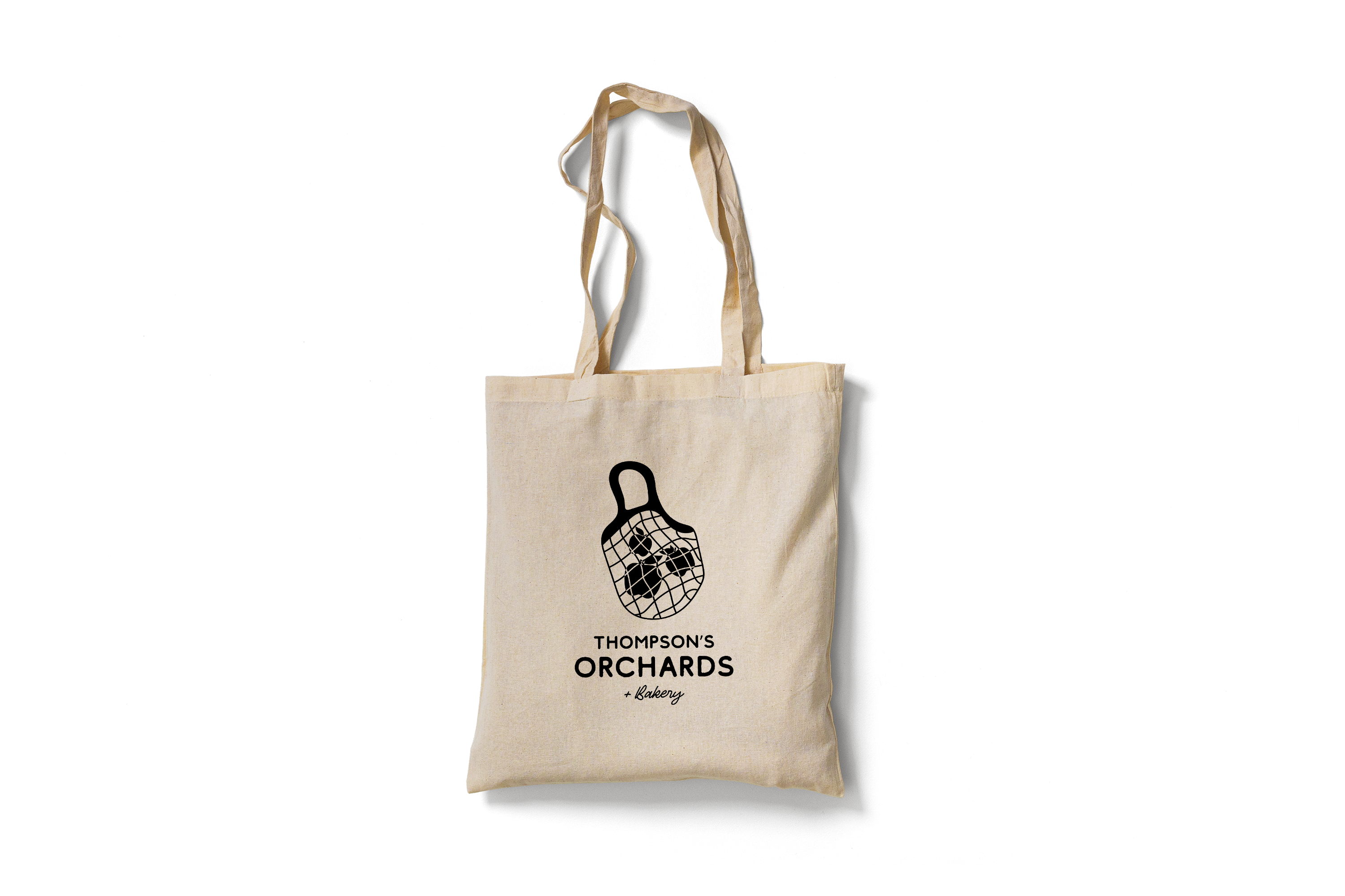

Thompson’s Orchards is a family owned and operated family apple farm. While crafting a brand that speaks to the heritage, I wanted to design echoes the organic charm of the orchard, pairing earthy tones with vibrant pops of color that reflect the bounty of nature.
From carefully chosen typography that balances modernity with tradition to a palette inspired by the warm hues of ripe fruits, every detail is a celebration of the orchard’s bounty. The design narrative is a harmonious blend of traditional orchard aesthetics and contemporary design principles. Each page of the branding guide unfolds a story of the orchard’s evolution, capturing the essence of time-honored practices while embracing the modernity required to thrive in today’s market.
From logo application to packaging design, each component is crafted with precision, ensuring a cohesive and recognizable identity that resonates with the orchard’s audience. Every decision in this design project is rooted in purpose. Typeface choices, color palettes, and imagery are carefully selected to convey not just visual appeal but a narrative that echoes the authenticity and passion behind Thompson’s Orchards.

Colors
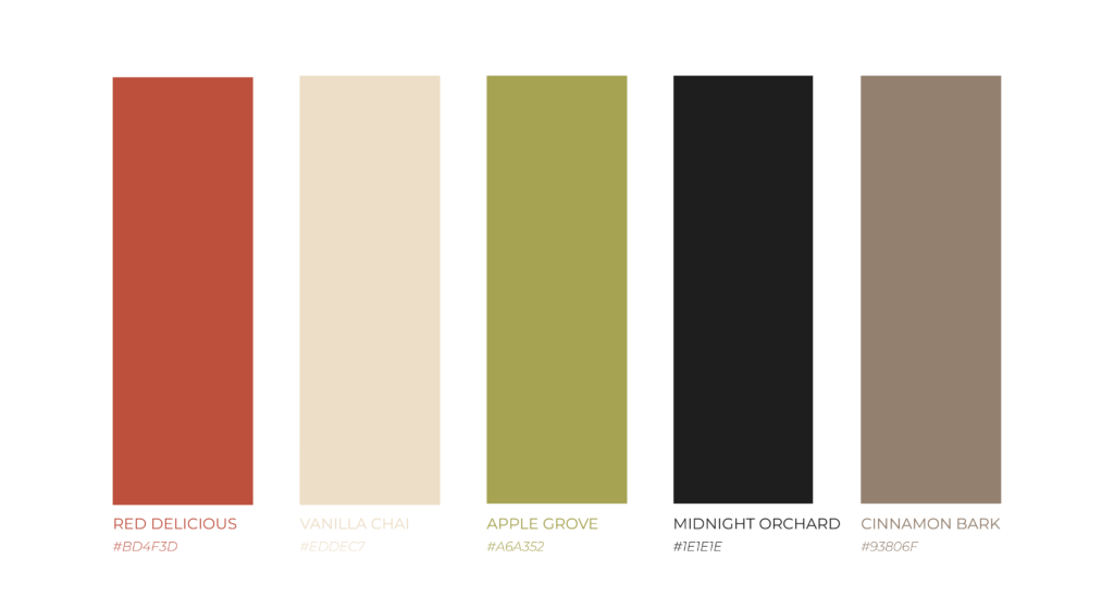
These color palette creates a feeling that is cohesive, organic, and authentic. #93806f, #a6a352, and #eddec7 work together to provide a sense of growth and organic sustainability. #bd4f3d conveys passion, boldness, and quality. #1e1e1e and #7d9b82 add grounding and stability to the palette. This color palette is sure to create a memorable brand identity that resonates with customers.

Typography
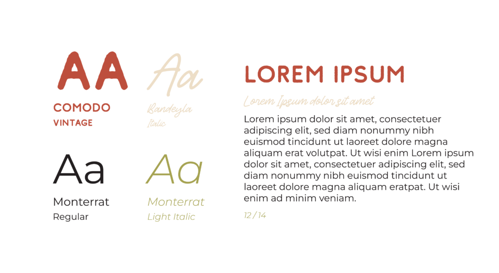
By combining rustic, vintage, and modern elements, these fonts can help to create a design that is both timeless and relevant, and that effectively communicates the unique character of an apple orchard. Use Comodo in Red Delicious for headers, Bandeyla in Vanilla Chai for sub- headers, Montserrat in Midnight Orchard for body copy, and Montserrat Italic in Apple Grove for any small snippets of text.
