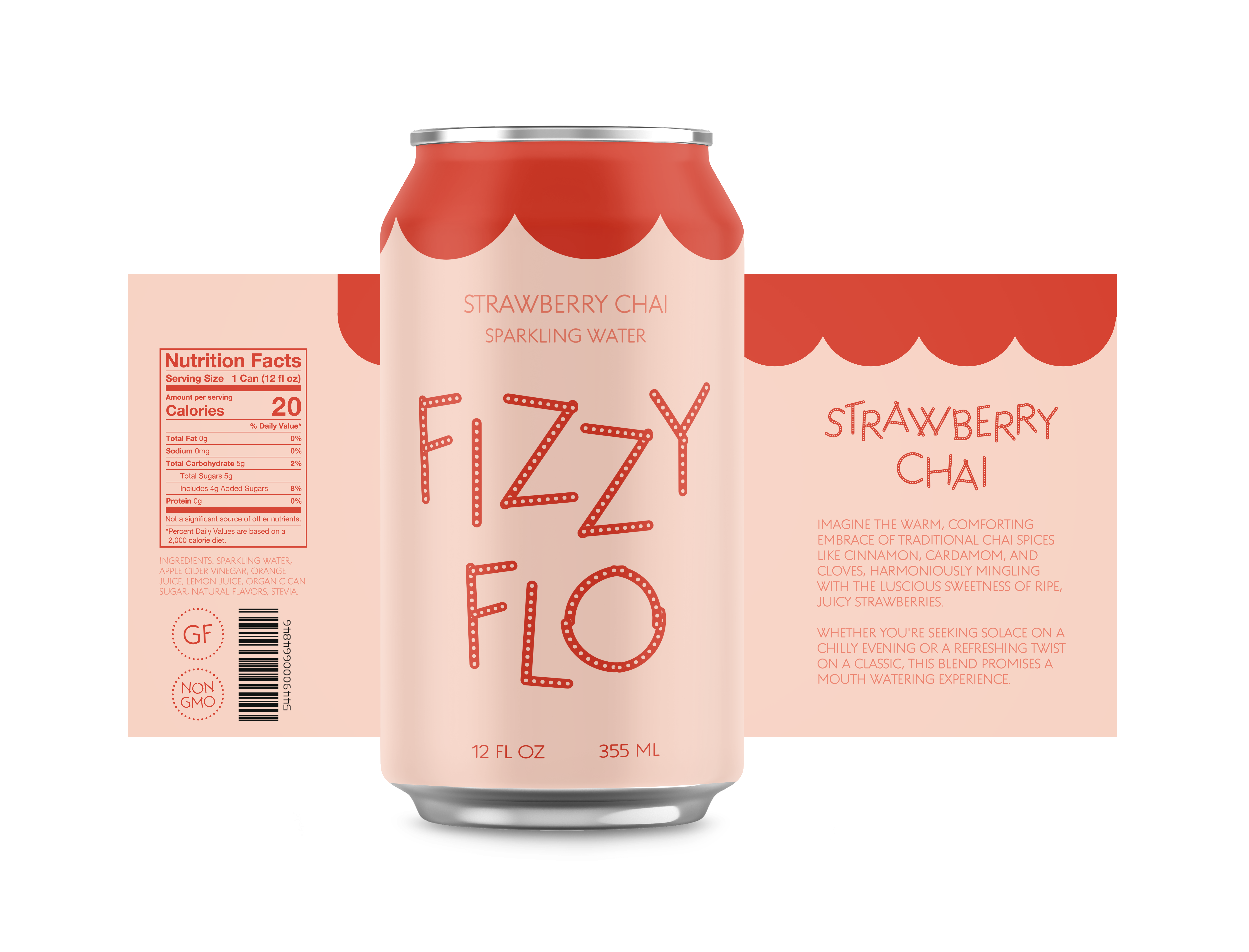

I used the Q Project typeface to play around with layout and packaging. The Q Project is a game-like type system that enables users to create a nearly infinite number of creative variations with a range of base fonts and dozens of decorative attachments that can be combined and layered.
I came up with Fizzy Flo. Fizzy Flo is a healthy, sparkling water. What sets Fizzy Flo apart is its dedication to health-conscious consumers. Free from artificial sweeteners and unnecessary additives.
This project used only one typeface and I played around with the different ornamentation that came with the font. I went with a monochromatic color scheme. Fizzy Flo, a brand synonymous with refreshment and wellness so, I wanted the colors to represent wellness and health. The soft, peachy tone embraces consumers with a warmth and invites them into a world of balance. Contrastingly, the deep coral red injects an energetic burst. This vibrant shade symbolizes the passion and liveliness.
I wanted to keep everything somewhat minimal because Fizzy Flo stands in its simplicity. The absence of extraneous elements on the can reflects the brand’s dedication to providing a pure beverage experience. Fizzy Flo’s minimalistic can design speaks to a brand that values simplicity, authenticity, and the intrinsic beauty of a healthy, sparkling lifestyle.
