BOMBORA
UTAH TECH UNIVERSITY SENIOR CAPSTONE
DESCRIPTION
Bombora is a surfwear brand I created from the ground up as my senior capstone project. Inspired by retro surf culture and laid-back coastal living, Bombora is all about easy comfort, vintage color palettes, and that sun kissed energy.
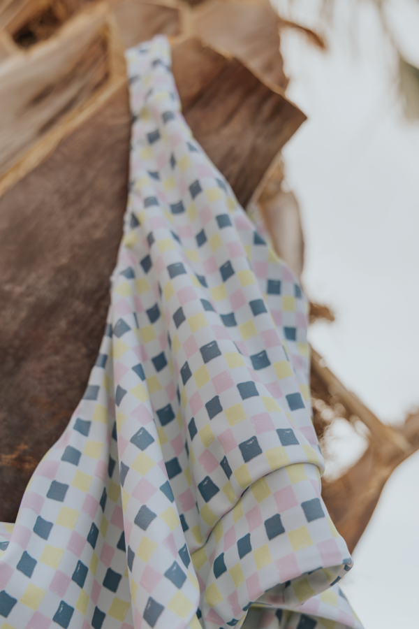
This project was all about capturing a feeling and turning it into a full-blown brand experience. I designed everything: the brand identity, custom fabric patterns for swimwear, lifestyle imagery, hang tags, packaging, and even a full lookbook to bring it all together. The vibe is laid-back and made for people who live for saltwater and sun.
PROCESS
I started with a deep dive into surf history, vintage signage, and color stories from the ’60s and ’70s. From there, That inspiration helped shape a strong brand foundation — I sketched out logos, defined a type system, built a color palette, and developed visual assets that channel the brand’s vibe.
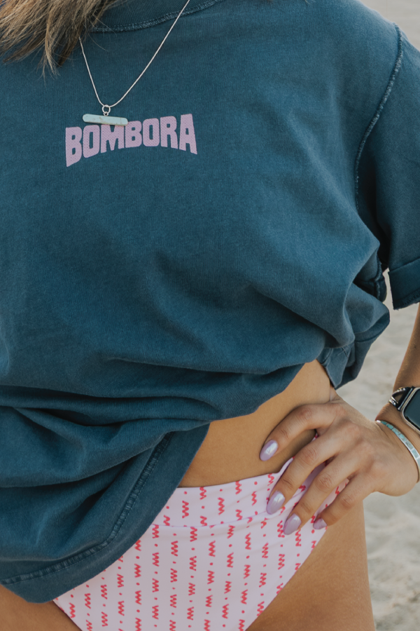
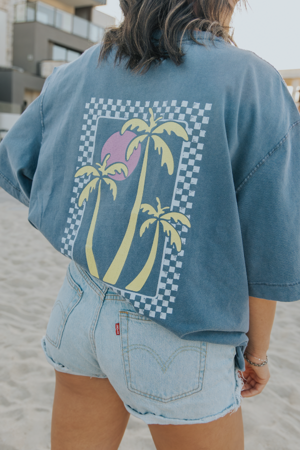
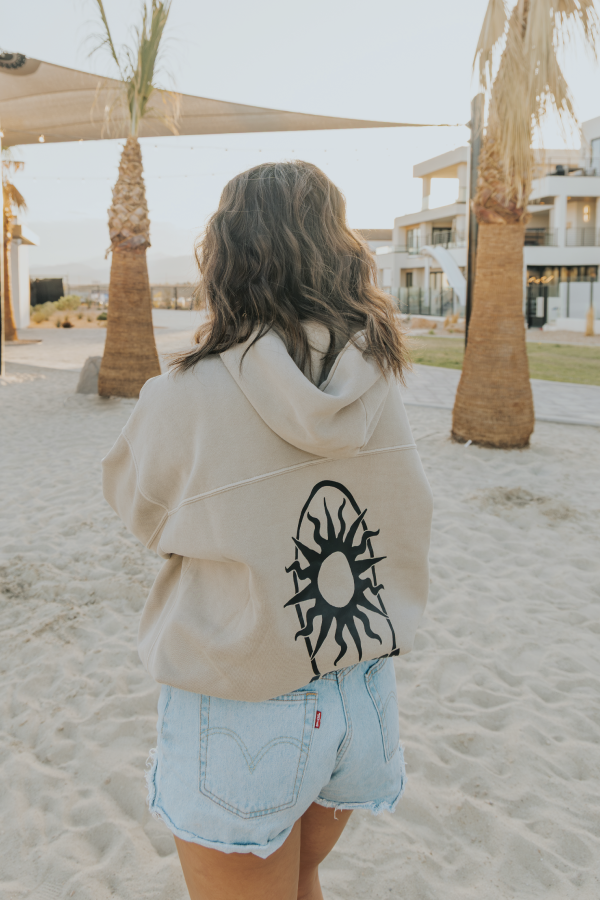
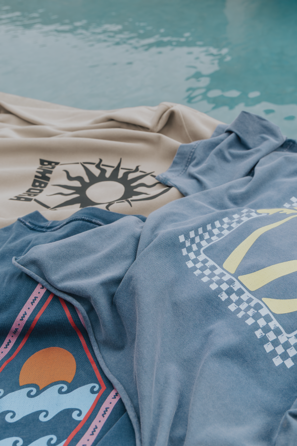
Next, I moved into apparel design. I created custom patterns inspired, which were printed on 4-way stretch fabric to produce original swimsuits and dog bandanas to match. To complement those designs, I created two matching t-shirts, designed as coordinating sets with the swimsuits. I then designed plus two additional tees that expanded the collection’s along with two sweatshirts and two shorts for the men’s collection.
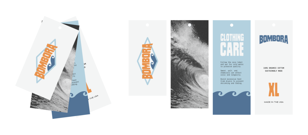
All apparel graphics were printed using direct-to-film (DTF) printing to ensure a high-quality, durable finish. To support the product line, I developed hang tags, packaging concepts, and took all of the lifestyle and product photography. Everything was brought together in a branded lookbook that tells the Bombora story from concept to creation.
DELIVERABLES:
→ Creative direction
→ Logo suite & brand identity
→ Typography & illustrations
→ Pattern design for fabric
→ Two swim sets
→ Apparel designs
→ Four t-shirts
→ Two sweatshirts
→ Two sweatshorts
→ Packaging design
→ Hang tags & product labeling
→ Lifestyle photography
→ Branded lookbook
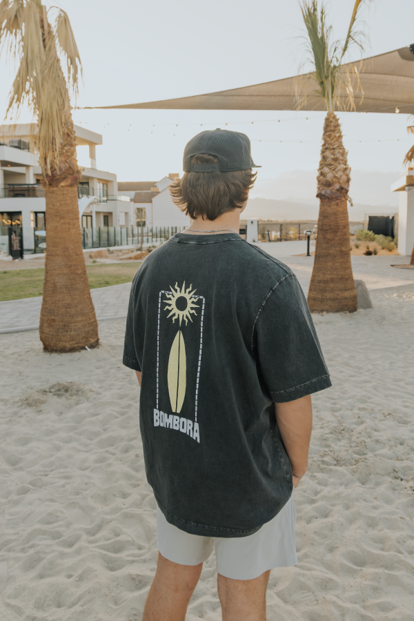
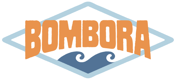
The Bombora logo is custom-built to feel playful, beachy, and full of motion — just like the brand. The wordmark sits inside a diamond-shaped frame. I used a soft blue for the outline to keep things light and open, like salty mist.
Under the wordmark, I added two stylized wave icons in a deeper blue. They give structure to the logo and tie in that surf culture feel without being too literal. The type itself is a bold, condensed, retro-inspired sans serif with curved edges and a slightly bouncy baseline — it gives off that natural, wave-like rhythm. I went with a tangerine orange for the text to keep it bright, energetic, and totally reminiscent of a sunset at the beach.
Every detail is meant to feel hand-crafted and intentional, while still keeping that laid-back, fun Bombora personality.
More Projects
bridal & veil