VERO GRANO
LOGO AND PACKAGE DESIGN
DESCRIPTION
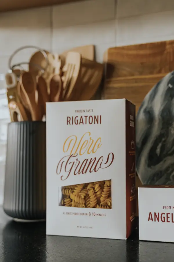
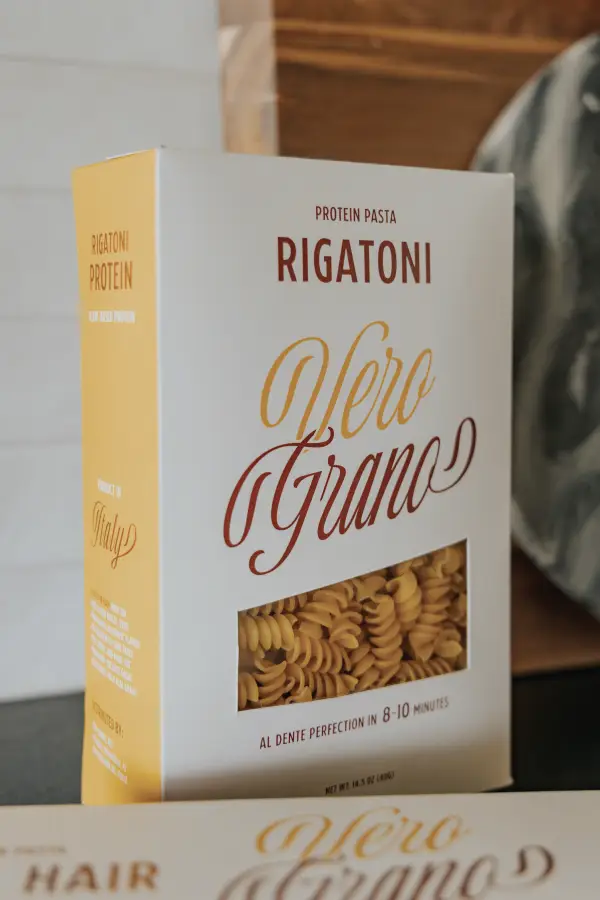
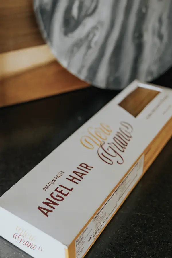
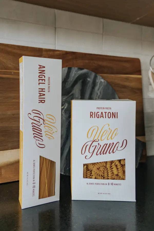
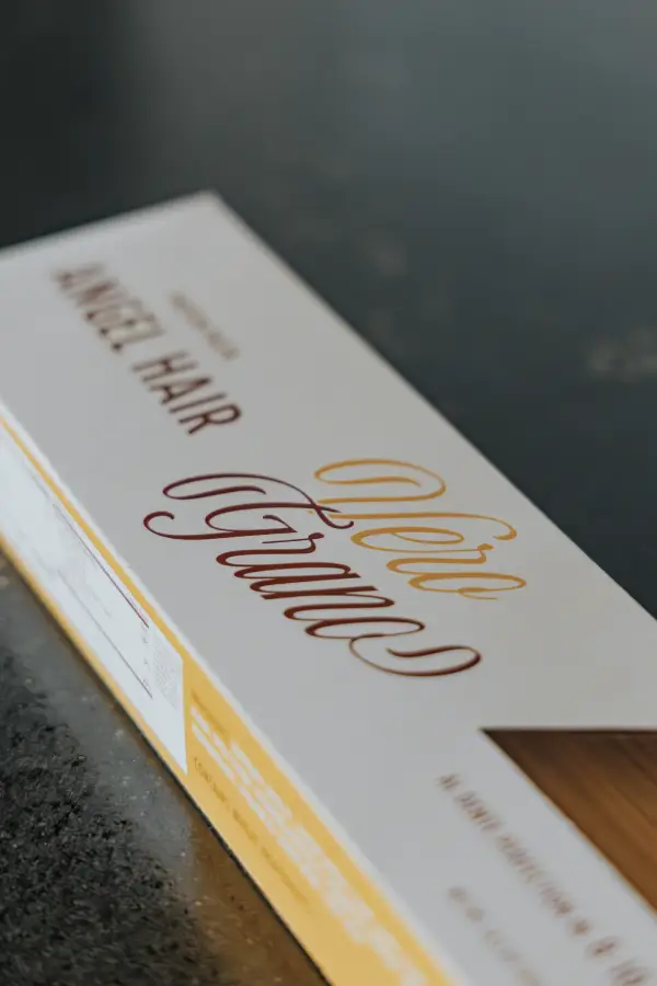
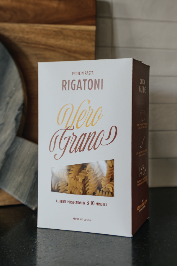
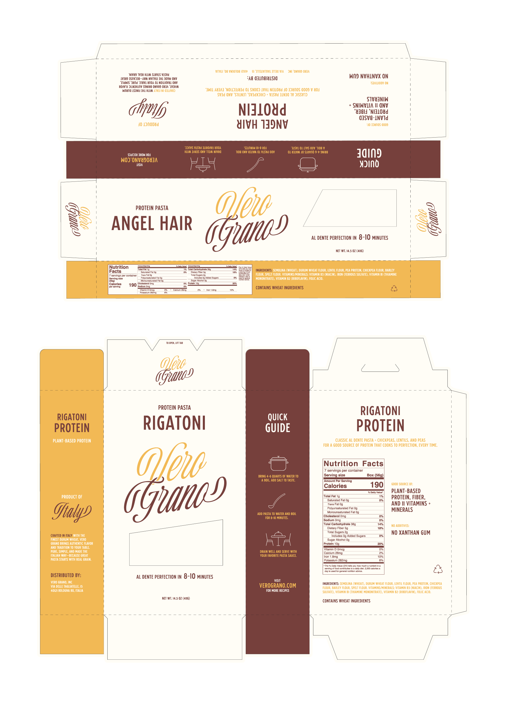
Vero Grano is a premium pasta brand rooted in tradition and authenticity. The concept centers on quality ingredients and Italian heritage, with a visual identity that feels both nostalgic and modern. I created the logo and packaging design for this plant-based protein pasta line, specifically for their Rigatoni and Angel Hair product.
PROCESS
The visual tone is warm and rich, just like the pasta itself, golden yellows and earthy browns create an inviting presence. The logotype is script-based and customized to intertwine, channeling a rustic Italian charm while maintaining shelf-ready professionalism. The box design is clean and functional, featuring a recipe guide, nutrition facts, and ingredient callouts — all laid out to feel approachable and high-end.
I intentionally placed the typography for maximum hierarchy to make sure the important product info stands out. A focus on “real grain” and “plant-based protein” reinforces the brand’s health-forward approach without losing its comforting roots.
DELIVERABLES:
→ Logo design
→ Full packaging design for boxes
→ Brand tone development
→ Copywriting for box details
→ Print-ready dieline
→ Printed composition
More Projects
bridal & veil