
BEACHY PEACH
BRAND DESIGN
DESCRIPTION
Beachy Peach is a swimwear brand inspired by sun-soaked days, ocean breezes, and that easygoing, carefree energy summer brings. The goal was to create a visual identity that feels fresh, playful, and effortlessly warm, something that reflects the brand’s love for the season and surf lifestyle.
PROCESS
It all started with the vibe. I built mood boards full of sunlit beaches to lock in the right tone. Once the name “Beachy Peach” came to life, I started sketching out concepts that blended minimalism with personality.
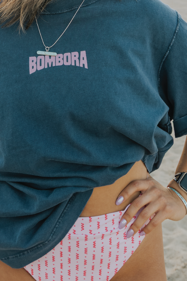
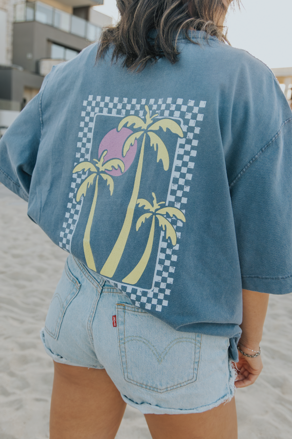
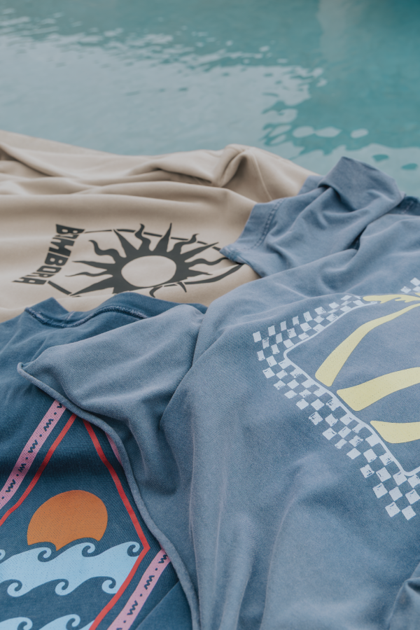
Typography was chosen to feel friendly and breathable, while the brand colors mix peachy oranges, sandy tans, and sea-inspired greens, creating a palette that’s grounded yet vibrant. The peach logo mark was refined into a clean, modern icon using leaves to form the shape, giving it a memorable, organic twist. I also mocked up the brand on tags, signage, and labels to show it in real-world use.
DELIVERABLES:
→ Creative direction
→ Brand identity
→ Logo design
→ Color palette and typography guide
→ Apparel tag and label mockups
→ Window decal + brand usage examples


More Projects