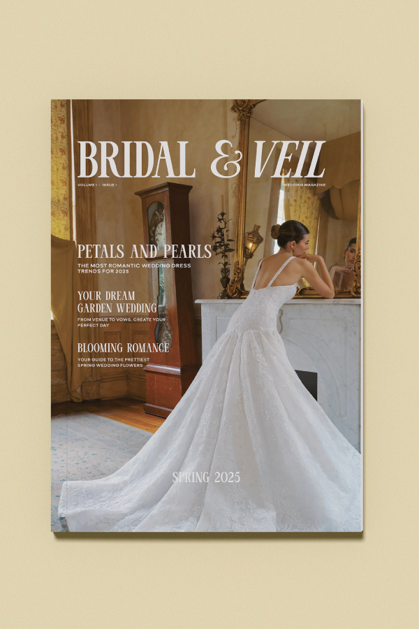
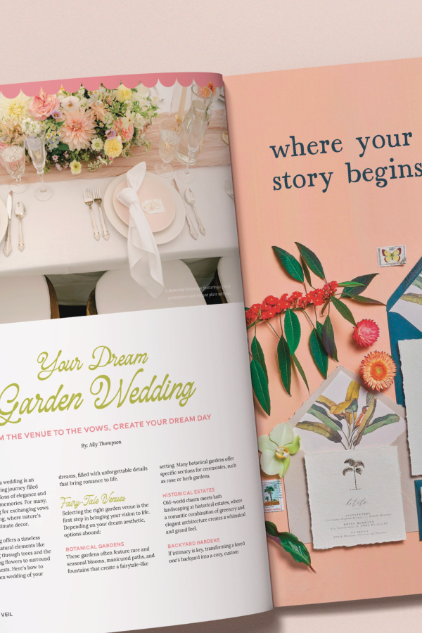
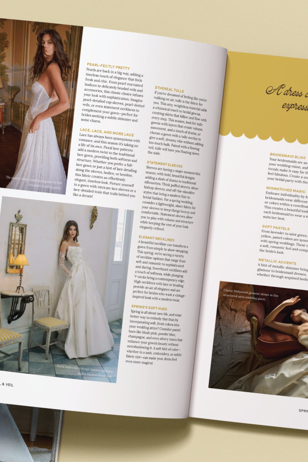
Bridal & Veil is a 24-page wedding magazine concept I created. Think spring garden weddings, dreamy florals, and fresh, modern design. The whole piece is meant to feel like a high-end bridal publication you’d pick up at a boutique. This issue, specifically, is full of inspiration and real-life ideas perfect for a Spring wedding. I also included four concept ads for wedding-forward brands to make it feel like a fully flushed-out magazine, not just a school project.
PROCESS
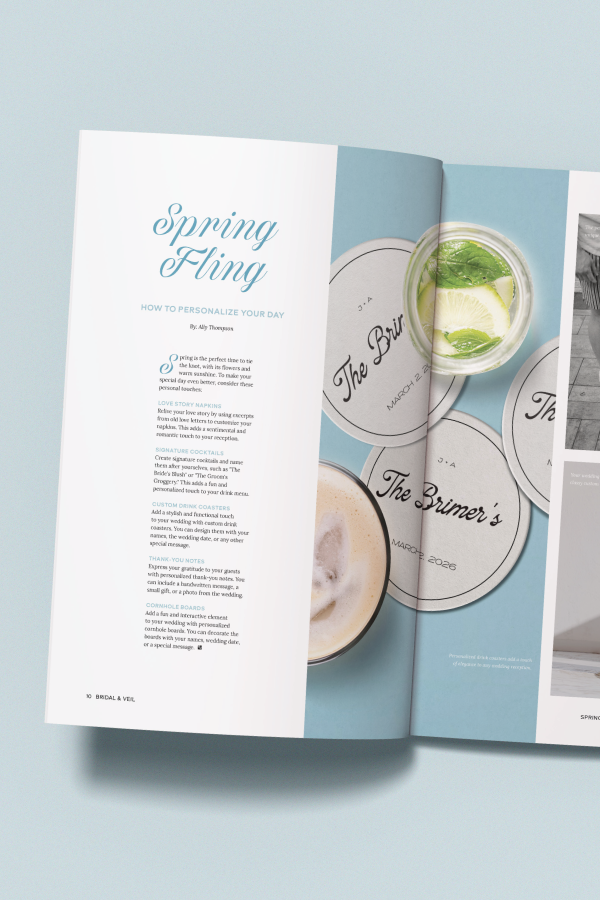
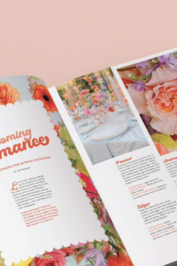
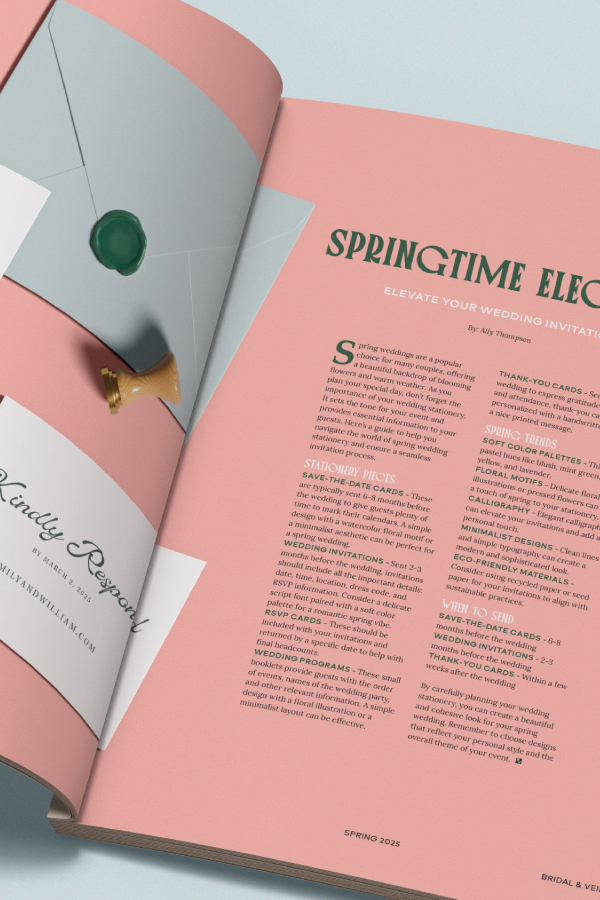
This project started with a vision: romantic but refined. I pulled inspiration from real wedding publications, garden venues, and delicate floral arrangements to create a soft and cohesive visual style. The layout is built around light, airy color palettes and feminine typography that lets each page breathe. I wrote every bit of content — from features to vendor highlights — to feel authentic and full of personality.
To give the magazine a polished, realistic feel, I designed four custom ads for wedding brands: Poppy Flowers, Birdy Grey, Brilliant Earth, and Minted. While the photos were sourced from Unsplash and Google, everything else like the layout, design, typography, and copy, is my own.