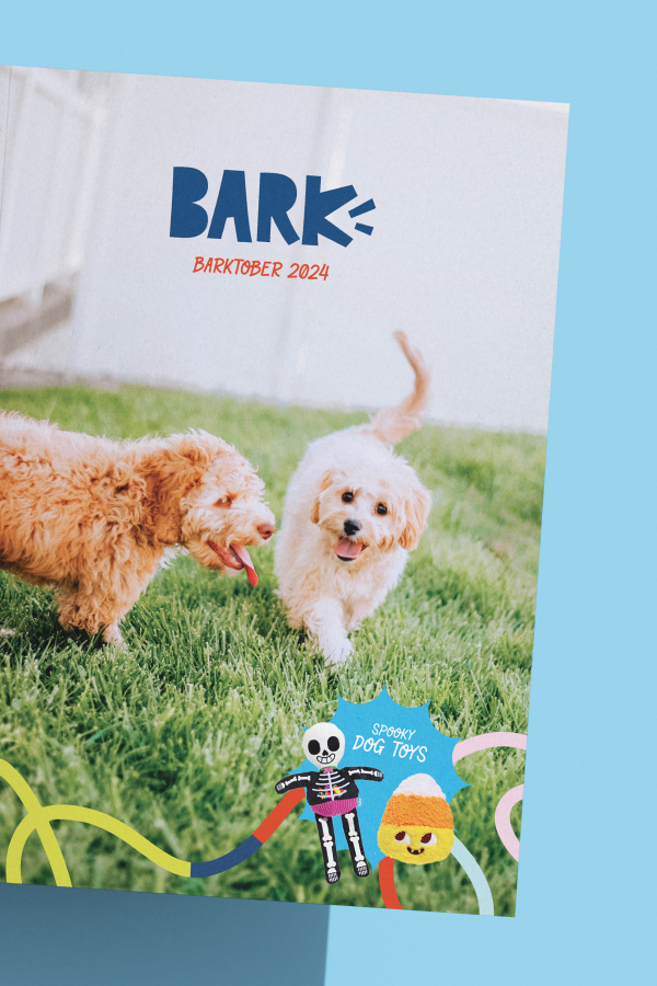
BARKTOBER CATALOG
12 PAge Product catalog
DESCRIPTION
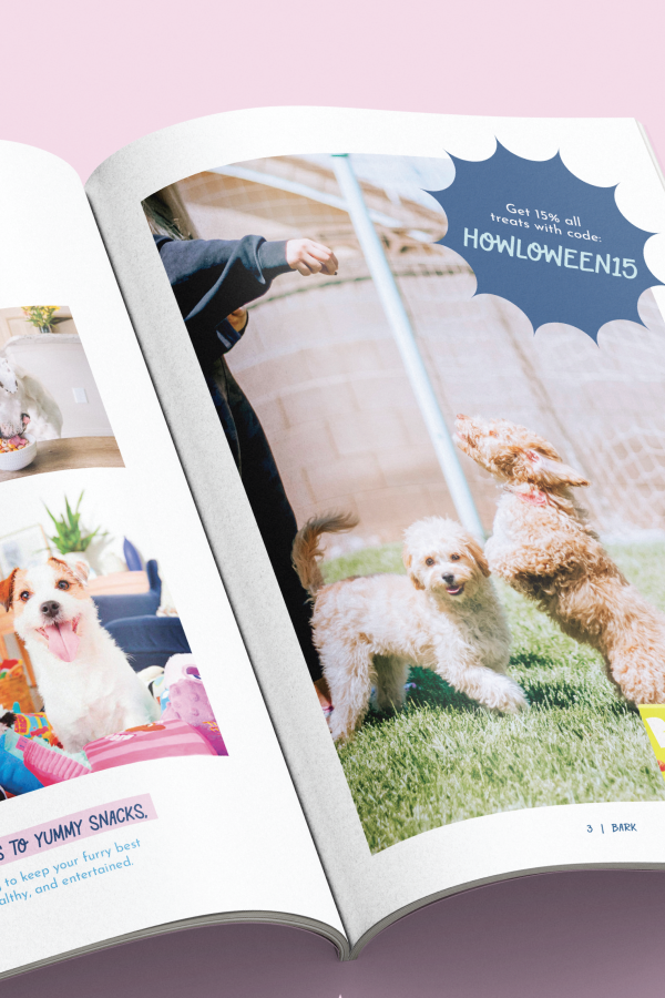
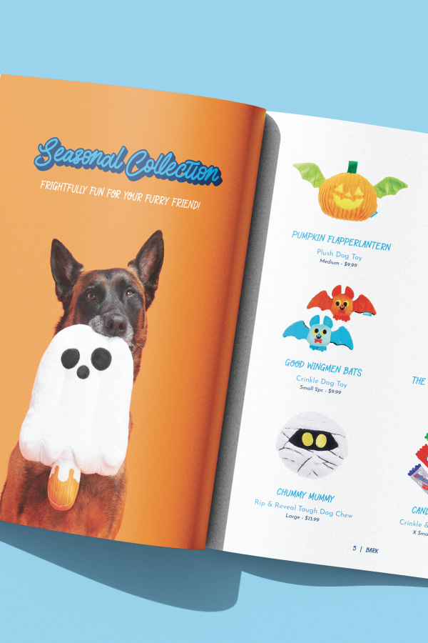
This is 12-page product catalog designed for BARK. I named it Barktober 2024 because of the featured Halloween edition toys. While most pages focus on toys and treats, it also includes two standout sections: a festive Halloween-themed spread and a new layout announcing BARK’s expansion into kibble.
PROCESS
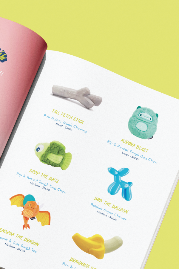
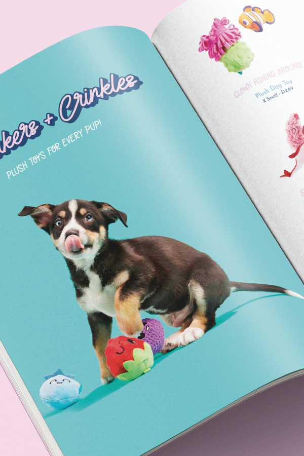
I sourced product images directly from BARK’s website, then used Photoshop to cut out each product and remove the backgrounds. This made the items pop and feel catalog-ready. From there, I designed and laid out every page to feel fresh, organized, and on-brand, using big typography, playful graphics, and vibrant layouts that match BARK’s energetic style.
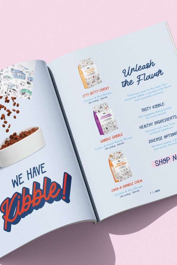
The Halloween section brings in some fun seasonal flair, while the kibble spread breaks from the toy-heavy flow to introduce a clean, modern presentation for BARK’s newest product line. That section was designed with intention, giving it a fresh, minimal feel to signal something new and exciting in the lineup.
DELIVERABLES:
→ 12-page BARK product catalog
→ Layout design and visual direction
→ Halloween-themed spread
→ Dedicated kibble feature spread
→ Typography and color palette
→ Printed composition
More Projects
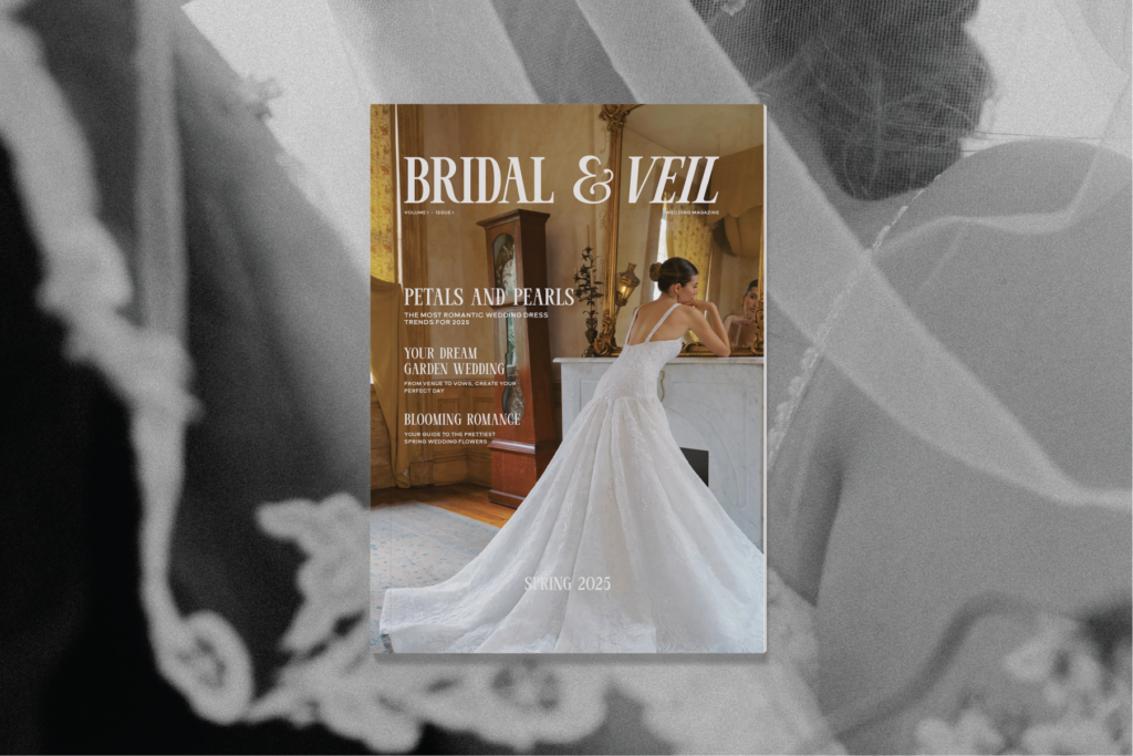
bridal & veil